Spirit Daughter Logo Design
The Brand
Spirit Daughter is a lifestyle brand rooted in cosmic wisdom and intentional living “devoted to helping you live your best life through understanding the energy of the Universe.” Based in Venice, CA, their offerings span moon journals, free astro resources, digital workbooks, and the Moment app, each designed to support rituals, energetic alignment, and self-discovery.
The Challenge
At the time of their launch, Spirit Daughter needed a visual mark that could embody the unseen emotional and spiritual energy they were pulling into the world. The ask from the founder:
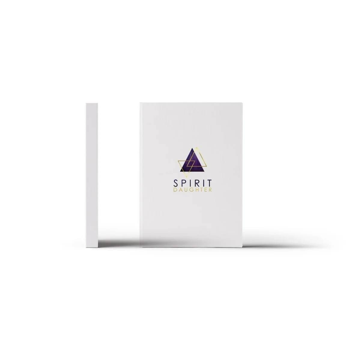
A triangular emblem, hinting at balance, elevation, and sacred geometry;
A color palette of indigo-purple and gold, capturing depth, transformation, and divine vibrancy;
A design that felt “beautiful enough to go alongside their dream.”
Design Strategy
I started with the triangular structure to symbolize alignment with cosmic cycles and energetic flow. Paired with a regal indigo-purple base, I layered in gold accents to evoke illumination and inner alchemy. This color interplay mirrors how Spirit Daughter phrases their mission as igniting magic and expansion through astrological clarity and intentional practice.
Final Solution
The resulting logo is both grounded and ethereal, a visual anchor in Spirit Daughter’s visual identity. Over time, it has become:
Their publishing imprint, appearing on the backs of books and workbooks;
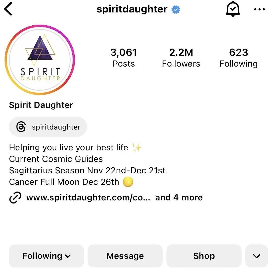
The digital hallmark across newsletters, app interfaces, and website headers;
An emblem of energetic resonance, recognized by their community as a symbol of transformation and cosmic connection.


Brand Alignment & Voice Connections
Spirit Daughter’s current language reinforces the design choices made:
“Live your best life through understanding the energy of the Universe.” The logo’s triangular shape and colors amplify this ethos of living in cosmic alignment.
The seasonal moon workbooks promise invitations to “step boldly into the unknown,” “break free from fear-based decisions,” and “align with your favorite version of yourself.” All of which speak to the logo’s role as a gateway to spiritual empowerment and transformation.
Impact
Consistency: The logo has anchored Spirit Daughter’s aesthetic across physical and digital touchpoints, helping build brand recognition in spiritual and wellness circles.
Emotional connection: Community members resonate deeply, expressing that the workbooks, and by extension, the brand identity, feel like a “hug and wink from the universe.”
Growth: The brand has evolved into an energetic platform (think app, courses, products), and the logo continues to hold its own across initiatives as diverse as moon rituals, manifestation tools, and app experiences.